Signal smoothing is not a new concept, but it is still being used in many cutting-edge applications. At its core, signal smoothing represents a variety of algorithms used to remove the noise from a data set to reveal important patterns. A wide variety of techniques are available for smoothing out your data — from simple algorithms like moving averages and polynomial splines to Kalman filters and RDP decimation.
All those methods will smooth your signal data for sure, but one question always surfaces — “Is this the right amount of smoothing?”

We recently encountered an example of this while developing NASH, Blueprint Technologies’ video analytics product. As with any detection algorithm, we had noise in our signal, making insights and behaviors much harder to identify. A simple example of this would be when a video analyst wants to see all parts of a video where more than 20 cars were visible at an intersection. A simple threshold request, but one riddled with challenges from noisy data.

Raw detection data from a stationary camera monitoring an intersection at about 30 frames per second. The red circle shows a simple example of how the noise can be problematic for analysts searching for threshold events.
Explore simple solutions fast
The data science team at Blueprint Technologies embraces an agile development philosophy because we understand that the fastest path to meaningful, useful solutions is through iteration and feedback. We began the NASH signal smoothing process with two simple solutions to achieve quick results with the idea of iterating further from there. We began with moving averages and spline interpolation with sampling.
Moving averages
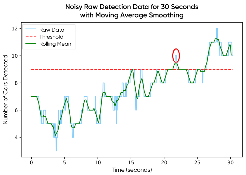
Moving averages gave clear feedback. The data was smoother, but it still wasn’t “smooth-smooth.” The initial response from our data scientists was to increase the window size for the convolution function, but that came with its own set of challenges:
- Can we choose a window size that works for every user?
- Can we explain this to users in a way that allows them to then know how to choose their own window size?
Cubic spine interpolation with sampling
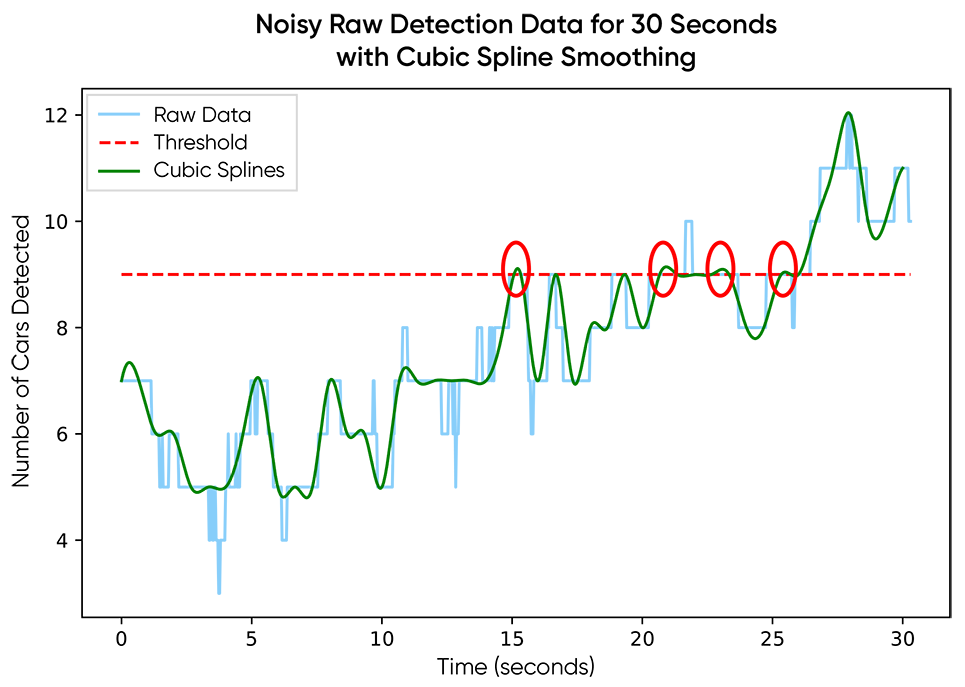
Cubic spline interpolation with sampling produced similar results with a few new pros and cons. The results were smoother than those achieved using the moving averages option thanks to the continuous derivatives, but that introduced new noise into the data, also thanks to the continuous derivatives. Regardless, we were still stuck with the same two challenges as moving averages: window size/sampling frequency and explainable configurations. Also, choosing a sampling frequency means potentially throwing out a bunch of data. You can work around these information loss issues by using detection confidence scores to guide which frames to keep, or even layering your sampling on top of the rolling mean smoothing so you keep the information around, but then you have to choose a window for smoothing and choose a sampling frequency.
Designing solutions for our users
At the end of the day, it doesn’t matter how cool of an algorithm we come up with to implement some exciting smoothing math. What matters is smoothing the data in a way that allows our users to solve the problems that are important to them. The difficulty is that there is no one-size-fits-all solution here. We needed to create a smoothing parameter for our users, but we needed to do it in a way that made sense to them intuitively.
Fourier analysis
To accomplish this, we looked to Fourier analysis. By asking the user about the timescale of their analysis, we can filter out frequencies in our signal that are too high for that timescale. A simple example is finding behaviors like traffic jams. A very short occurrence of many cars in the video would not be considered a jam on its own (high-frequency events) but a sustained high count might (low-frequency events). With simple examples like this, we are able to explain to our users this behavior timescale concept and have them choose the timescale for their analysis.
We accomplish this with Fourier analysis tools. The premise of Fourier analysis is that you can represent a function (or discrete time series) as a sum of many sine and cosine functions reasonably well, as long as you use enough of them.

Fourier Series definition from Wikipedia
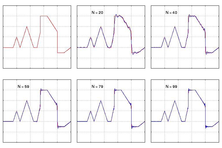
A plot showing the convergence of a Fourier series to a relatively arbitrary function as more terms (N) are included in the approximation. Notice that it only takes about 10 or so terms to roughly match the shape of the underlying function. As you continue to include more terms with N>10, we gradually match the shape better, but we start to see what looks like high frequency “noise” near discontinuities (this is called the Gibbs phenomenon.) Source: Wikipedia
Signal processing and filters
Fourier tools have been used in the signal processing world for decades, and they have come up with some great tools we can borrow. For this task, we designed a filter for our signal that cut out the noise (high frequency) and kept the larger trends (lower frequency). The cool part about these filters is that they work similarly to moving averages: by convolution of our signal with a window function. All we are changing is how we build our window function.
If you haven’t read up on creating these frequency filters from scratch before, you can see more detail here. To summarize the process, we can build a frequency cutoff into our filter using a relatively simple sinc function multiplied with a Hamming window (or another attenuation window of your preference) to reduce the ringing effects of discontinuities in a truncated sinc filter.
We asked our users to provide the understandable behavior timescale and constructed our frequency cutoff using that and the sampling frequency, which in this situation, was the frames per second of the video data if you are using all frames of the feed.
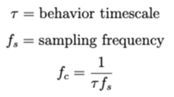
After we had the custom cutoff frequency, we constructed a standard lowpass filter with a standard sinc function multiplied by our preferred ring-reducing window function – Hamming.

Putting the math together, we plotted the windowed-sinc filter kernel and its frequency response given by a Fourier transform. From there, we could see from the plots that the frequency response did not allow frequencies greater than the cutoff frequency indicated by the dashed red line. The discussion could continue from here to include the transition bandwidth (how steep is the cutoff approximation to the discontinuity we theoretically wanted), but we’ll leave that rabbit hole for another day.
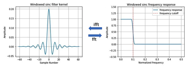
On the left, we have a window filter kernel computed as the product of a sinc function (including information about the user’s preferred frequency cutoff) and a hamming window. On the right, we have the frequency response of the filter, which shows low frequencies (less than) are passed through and higher frequencies (greater than) are stopped. Fft stands for fast Fourier transform and ifft stands for inverse fast Fourier transform. Transforms were computed with a standard numpy package.
Results
With a custom low-pass filter set to a timescale of 20 seconds, we were able to reduce the noise, making it so the threshold is no longer surpassed, and the user can continue with their actual objectives, identifying insights and behaviors from their video footage, instead of wasting time wiggling sliders to adjust mystery parameters like “window size” or “sampling frequency.”
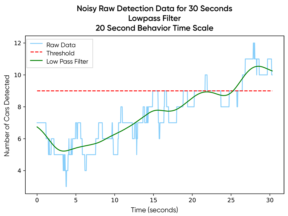
Beyond creating this simple-to-visualize threshold example, there are many downstream processing events dependent on this smoothed data that share the same dependence on the user’s timescale. With this functionality Blueprint incorporated, NASH users are also able to apply it in other areas, such as the identification of patterns, behaviors and similarities to other processed videos. This appropriate-for-the-analysis smoothing is a critical component of any analysis workflow in NASH.
At Blueprint, the experience and expertise of our diverse team of data scientists are paramount in our customer-focused agile approach to delivering data science results. From bleeding-edge deep learning architectures to domain-specific tools and algorithms like the one described within this blog, Blueprint’s data scientists work together to deliver solutions to real business challenges.

