If you think German is the most challenging language to work with in visual design, it’s probably because you haven’t worked with Finnish. These languages, among others, offer a challenge rarely seen in the English language, with long compound words that are not design-friendly.
As a localization production artist, my job is to weave words into beautiful, accessible and friendly images. It sounds simple at first, but when you add 26 languages to the fold, it creates a new level of complexity and appreciation for the craft.
A few years ago, I got lucky. I had just graduated from The Art Institute of Fort Lauderdale and landed a job in a AAA game studio as a Spanish localization tester. It was surreal landing a job in video games. Considering it was my first job, though, I found it difficult to refuse. Localization was new to me and I didn’t really understand the impact I was making.
At the time, working as a designer in localization seemed impossible. A colleague once told me, “Hey, I don’t think this role is right for you. There are simply no designers in localization.” Truth is, I believed him. Have you ever felt like your career is going in one direction and then you hit a brick wall? That’s exactly how I felt.
It wasn’t until a few years later that I found that “non-existent” role at Blueprint Technologies. Now I use my design skills to support our clients as they reach out to a diverse, global market. In addition, I get to collaborate with 60+ language specialists to support video game localization across 30+ different languages.
Why is this all so important? If you’re reading this article and you don’t speak a second language, you’ve probably never had to worry about Localization. But the appetite for video games is not restricted to English-speaking audiences. Let’s assume you’re a 16-year-old from Argentina who doesn’t speak English as a second language and are trying to buy your next video game. Let’s take it even further and assume there are millions of teenagers all across the globe who don’t understand English. Suddenly localization becomes a necessity, rather than a service.
However, localizing images is a lot more challenging than it sounds. We have to consider the visual hierarchy, color contrast, typography and layout of the English version. Not taking these into consideration will result in clustered, awkward and inaccessible designs that miss the goal of visual communication. In this article I will illustrate some common localization challenges and considerations from a design perspective. I want to introduce you to the wonderful world of line breaks, glyphs, hyphens, line spacing and so much more.
On the localization team at Blueprint, my primary responsibility is producing visuals for the video game industry. These visuals include marketing, blog images and promotional campaigns. While the following suggestions will help those who work with game marketing, they also apply to visual design and graphic design professionals.

Length of words
In the example above, the text on the left is most likely to be localized but is restricted by the size of the containing boxes and width space. Containers, in this example, are the blue and white squares that sit behind the text. These are very common in marketing imagery. Even if these containers are editable, we still run the risk of insufficient space for long words. Therefore, it is best to remember the following.
The length of the English text does not equal that for most languages. As an example, “MID-YEAR DEALS” will most likely be twice as long for languages like Spanish, Italian, German, Russian, Finnish, Dutch, Greek, Turkish, Ukrainian, Romanian and Thai. Also, line breaks don’t work the same in English as they do in other languages. In this same example, we can use <BR> to indicate a line break. Therefore, “MID-YEAR<BR>DEALS” would be translated as “РАСПРОДАЖА В<BR>СЕРЕДИНЕ ГОДА” in Russian. By adding a line break, “MID-YEAR<BR>DEALS” will be rendered into two lines to accommodate the length of the Russian translation. You can clearly see this would impact the size of the intended text and, most importantly, the visual hierarchy of this image. Visual hierarchy refers to the most important elements on an image and their relation to the other elements. For example, “MID-YEAR DEALS” and “70%” are the most important elements and should be bigger in contrast to the other text in the image.

Containers
In this image, we can easily assume that we won’t run into localization issues. The image, after all, is all text and there appears to be enough space for long words. However, you may run into some issues. For example, the order of lines is not always the same.
“MULTIPLAYER<BR>DAYS” is “GIORNATE<BR>MULTIGIOCATORE” in Italian. We immediately notice that there is not enough space for the second line. As artists, it is our responsibility to make sure all containers are editable, so that we can avoid rework when we share art files with other artists.

Color
Color plays a significant role in marketing images. They can dictate mood, emphasis, branding and sometimes simply contrast. Regarding the example above, it’s important to remember a few key details.
The order of lines can impact the intended effect of the image. For example, for some languages, the order of “VR PICKS” could be reversed. It would read “SELAA VR -VALINTOJA” in Finnish, because the translation needs to take “Discover” into consideration. As a result, the intention of having “VR” sit in front of the “white circle” will simply not be realized.
What this image does well is that it provides enough contrast between text and background. As designers, we must assume that text placement could change. By creating neutral backgrounds (black or white) we allow more options for text color. Sometimes, due to branding restrictions, this is not possible. Ideally, we want to make sure that the background color works with the text even when the text color changes.

Layout
Layout is the arrangement of elements on an image. In this example, the image is taller than it is wide. In addition, the orange and blue containers could prove to be problematic for languages that have long translations. This type of layout is what we would label as “not very loc (localization) friendly” due to space limitations.

Font compatability
Typography is crucial in visual design. A perfectly designed image can be ruined by poor font choices. In the world of localization, however, this is the biggest challenge to overcome.
As an artist, you will have to allow flexibility for languages like Thai, Vietnamese, Turkish, Polish, Romanian, Hungarian, Greek, Russian, Czech, Ukrainian, Bulgarian, Chinese, Japanese and Korean. These languages have little support from fonts.
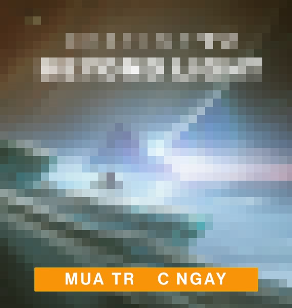
Of all the languages, however, Vietnamese and Greek are the most difficult to support. In the example above, the word “MUA TRƯỚC NGAY” is not fully supported by the font chosen for this image. It is highly recommended that you take advantage of fonts like “Montserrat” or “Garamond Pro.” These fonts are not only free, but also support a large number of languages.

Line spacing
Consider adding additional line spacing for Thai, Vietnamese, Chinese, Korean and Japanese. Sometimes you may have to do this for languages like Hungarian and Czech as well due to their unique glyphs.

Workarounds
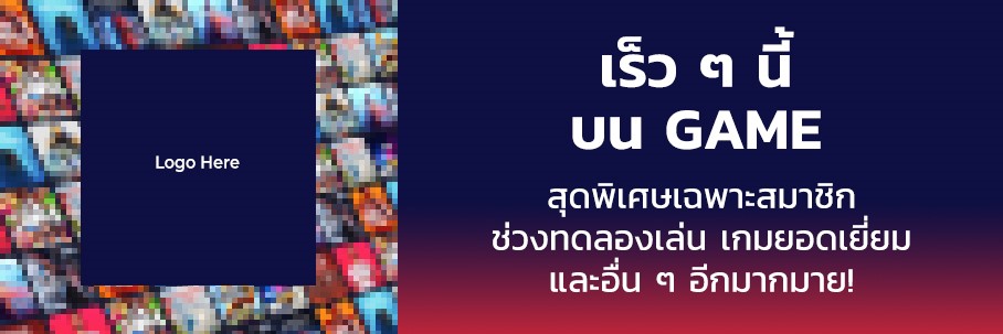
This image allows more than enough room for long lines of text. In addition, because the two lines are independent of each other, it makes swapping lines for languages that have different line orders easy.

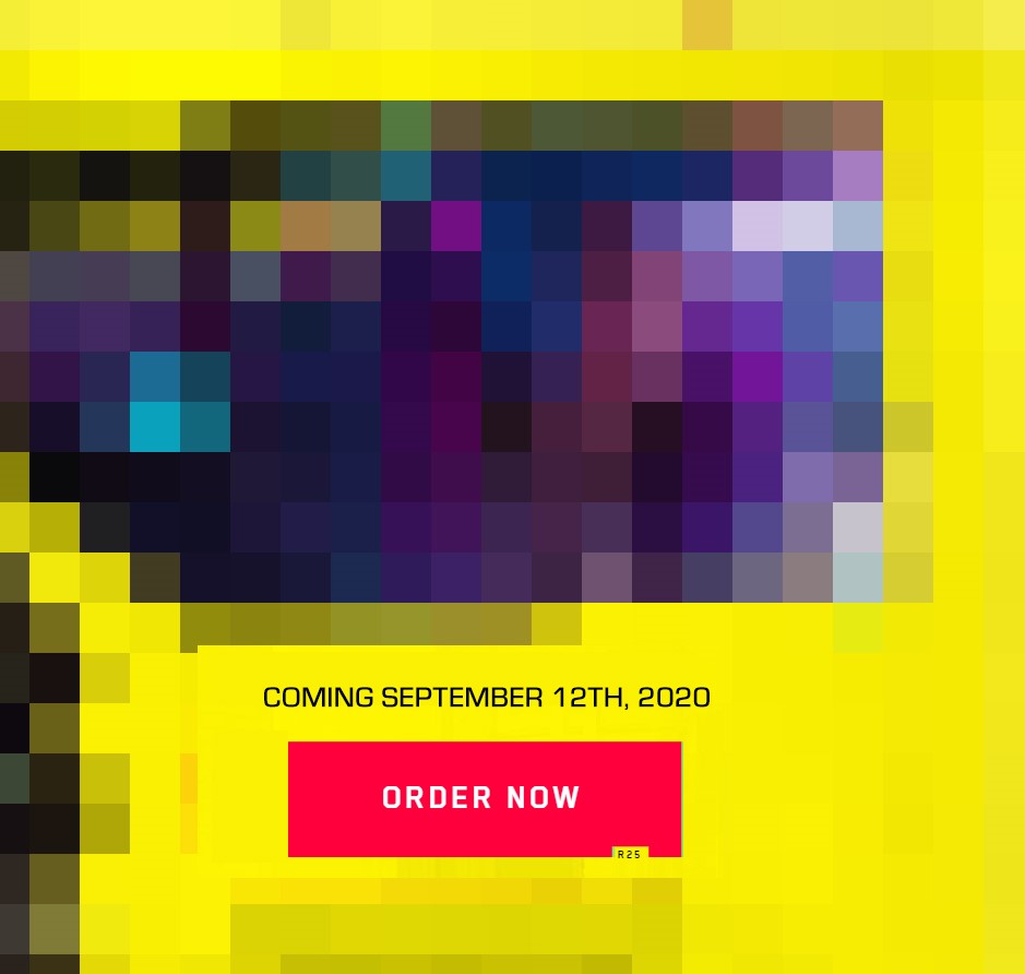
In this image, the “order now” button leaves plenty of room and the additional space on the right end of the container makes it localization friendly. It also helps that the “COMING SEPTEMBER…” text is aligned next to the CTA (call to action) for easy swaps.
I hope my experience on the localization team at Blueprint will help you in your creative projects for whichever languages you end up working with. After a little over a year, I have come to appreciate the nuances of language in a way I had not anticipated when I embarked on a career in visual design. Language and images, when skillfully joined together, can elicit positive and negative responses and ultimately influence consumer decisions. The more you work with a language, the more informed your design choices become and the better results you will achieve. I am very glad that this opportunity came my way when it did.
If you have enjoyed this post and are ready for your next opportunity, Blueprint’s localization team is always looking for talented people. Check out our open positions to learn more.

